


GOLD PROJECT
- Ellie

- Oct 18, 2018
- 2 min read
Having finished our ‘induction week’ at FCP, our first brief was set. The brief was ‘Colour’ at first thoughts it seemed quite easy - how hard could it be to research a colour? I was given the colour Gold and had the task to create a ‘Love it’ mood board which was a positive interpretation of the colour - celebrating its uniqueness and innovative uses of it. The second mood board was labelled the ‘Over it’ mood board which was to challenge the use of gold from a critical perspective.
I started the project with brainstorming what words came to mind when I thought of Gold, I then typed these words into Pinterest to create a bank of images I would use on my mood boards.
When we were originally given the brief I thought of Gold as quite a luxurious object which shows wealth - although this opinion still stands, after researching it I have also seen this as a negative aspect of gold where in more of a historical context it divided social classes by wealth and started conflict between countries.
This task got me thinking beyond the surface of the colour gold, I quickly made connections with religious ideas such as Temples which is not something I originally thought of when I thought of the colour gold.

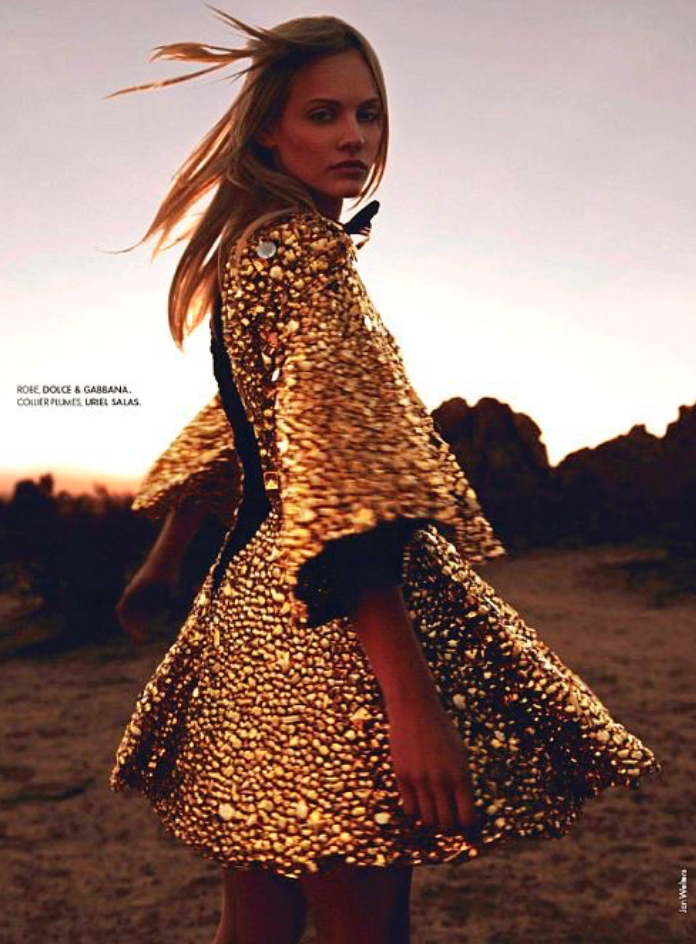
Aswell as this, it is used in christianity and catholic reference’s mainly as the circle of light which represents the 3 holy spirits - commonly seen as a halo around Jesus or Virgin Mary’s heads in religious images. Following on from this I found this being used by designers such as Versace and Dolce & Gabbana in their collections and most recently the Met Gala being based around ‘Heavenly Fashion and catholic ideas being the main focus of religious fashion. I found it very hard to place this in either ‘love it’ or ‘over it’ as I do personally really like this ‘trend’ and the use of gold within it - in particular couture pieces such as Jasmine Sander’s dripping in gold in a dress she wore at the Met Gala Ball this year - rather surprisingly designed by H&M. On the other hand the dress worn by Katy Perry to the same event, designed by Vesarce, will be featuring on my ‘Over it’ mood board due to how tacky it looked. For such a key event in the Fashion Calendar especially for couture designers I would expect something a little more innovative.


Comments